
Friday, 14 February 2014

My CD Progress..
My CD in progress:
Progress 1:
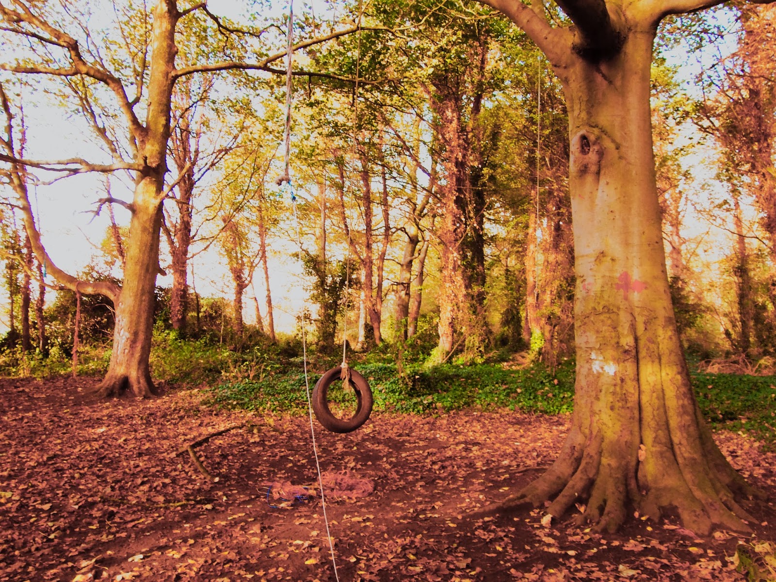
For my CD background picture i have used an existing primary photo which is also positioned on my album. The reason why i picked this photo is because it is a light colour so my black text will stand out more but it also keeps the continuity of my whole album as it fits in with the 'wood scene' to make it appear abstract. Picture is seen below.

Progress 2:
I have added the artist name and album name onto the CD. With the 'Quick Selection Tool' i grabbed a small part of the picture where the branches are reaching towards eachother and the background is very light. And put it over the CD, i changed the opacity to 20% so it looked faded. And with the quick selection tool i was able to cut around the picture making it into a circular shape. The edges look rough and wavey but i like the messy look it creates and think it adds to the abstract look of my album.

Progress 3:
This is my first draft of my actual CD:

The Progress Of My Album
My Album in progress:
Progress 1:
This is my album in progress, i have used a simple 6 digipak template so it is conventional to standard CDs already in the media - e.g my influence album covers.
Here i have used the same picture for my front cover as i did my magazine advert to create continuity and representation. I have used the same type of the font for the album name and artist name as i have used in the magazine advert.

Progress 2:
Above i have inserted a new picture also taken in the wood scene of my music video, i have used photoshop to edit the photo so it fits with the style of photo used for my front cover. I have changed the contrast and colour situation to get the effect that i wanted; this makes it look abstract.
Progress 3:
Here is my spine of my album; taken from another primary photo taken from the wood scene of my music video; i chose this part of the picture because it is a light colour and will show up the black text of my album well. As seen below:

Progress 4:

Here i have added another primary photo taken from the wood scene from my music video; like the other pictures i have edited the picture on photoshop by changing the contrast and colour situation to make it fit in with the other pictures to create continuity.
Progress 5:
I have added text of the album songs onto the back cover picture; as seen below: to create continuity i have kept with the use of wood scene photos.


Progress 6:
I have added two more primary wood scene photos taken from my music video; i have again used Photoshop to edit these photos, and to keep the continuity of the album fitting together i have made the photos look faded or abstract by changing the contrast and colour situation. Seen Below.

I have added these two photos for the background of where the CD's will be placed. I have changed the 'opacity' to fade them into the background. I have made all 3 photos (directly underneath) rotate 180 degrees so when the album is folded it will fit like an actual CD.

Progress 7:
I have added a 'barcode' and a 'virgin' logo on the back cover of my album to make it look real.


Thursday, 13 February 2014
Artist Information
Artist/Band name: Marseille
.jpg)
Album name: Oblivion

Album songs:
Album name: Oblivion
Album songs:
- Bitter Kisses
- Love Night
- Sail
- You & Me
- Reckless Youth
- Opposite
- The Draw
- Oblivion
- Rough Diamond
- Unicorn Blood
- White Lies
- Flashing Lights
- Numbers
Wednesday, 12 February 2014
My Magazine Advert:
My Magazine Advert In Progress:
My magazine advert photo is an edited primary photo taken of the location of my wood scene in my music video. I have edited this photo on 'Windows Live Photo Gallery' by using tools to change the 'Contrast' and 'Colour Situation'. My inspiration of these photos for my magazine advert have been taken from official magazine ads like Kings of Leon, The Verve and Coldplay (which i have posted on my blog earlier) here are 3 possible photos i could use:


I have chosen this photo:

My mag ad so far (first initial stages):
Progress 1: As you can see i am using 'Adeobe Photoshop' to make my magazine advert for my album. I have cropped my initial photo, i have added a 'App Store' at the bottom to show realism and the importance of digital technology when advertising. And i have written the release date as 'August 2014'.

Progress 2:
To make it look more realistic i have added 'NME ****'. This adds to the representation of the magazine being real and of a alternative rock genre due to the connection with the NME magazine which is a popular music magazine with that particular genre. Just from this the audience will donnotate the genre representation.

Progress 3:

Progress 4 and final product:
I have added the album name 'Oblivion' which on photoshop i again used the 'Quick Selection Tool' so i was able to just get the black text. I got the text from Dafont.com which is called 'Araul' compared to the background it looks faded but i like this contrast as it fits with the faded photo on the background which makes it look abstract.

Magazine Album Adverts:
These are a couple of magazine album adverts which will influence the creation of mine:


CD template:
My digipak template:
Here is the overall link i have got my templates from: http://www.discwizards.com/cd-dvd-artwork-templates.htmHere is a link to my CD digipak template http://www.discwizards.com/templates/digipak6Panel2CD-DW.pdf which i will be using to create my album from.
As you can see it is a standard 6 panel digipak template which a lot of CDs will be made from.

My CD:

Ancillary texts:
1. A promotion package for the release of an album, to include a music promo video, together with two of the options:
•A cover for its release as part of a digipak (CD/DVD package);
•A magazine advertisement for the digipak (CD/DVD package).
Wednesday, 5 February 2014
Font text for ancillary texts:
For the font i have looked on a website called dafont.com which provide a wide range of fonts and here are some possible fonts i could use for my ancillary texts:


For the album name i want the text to look simple and plain - which will stand out against the artist name. This has been inspired by other alternative rock genre album covers. The album name font will also be used for the tracks on the back of the album.


Fonts i may use for the Artist Name:
I have chosen these fonts for the Artist name due to their abstract view and how catching they look - i imagine if they were on an album cover it would fit the representation of alternative rock genre due to the fact they are unusual and different. My favorite is 'Blake'.
Fonts i may use for the album name:
Possible Ancillary Text Photos:
I have chosen these primary pictures taken from the woods location featured in the music video as possible ancillary text photos. I have chosen these photos to give off an abstract view on my album, this idea is taken from the influencing/inspiring original album covers (also featured on my blog) to connote the alternative rock genre to the audience.


.jpg)
Subscribe to:
Posts (Atom)